Brand: CRONVEST
CRONVEST
Situation
After 20 years of successful work and company’s development, the name and the identity of “Chestnut 2000” became outdated and stoped to illustrate the essence, values, and level of service of the company.
Idea
We surveyed the brand audience and found out that the company is approached by people who need money quickly without any red tape so they will not stop their business. And “Kashtan 2000” solves all financial issues without unnecessary questions.
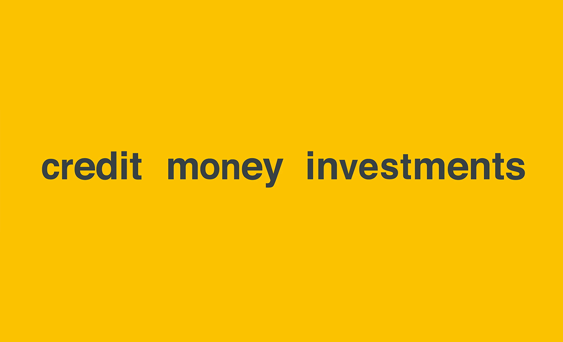
This is how the name Cronvest and the descriptor appeared: “credit money investments”.
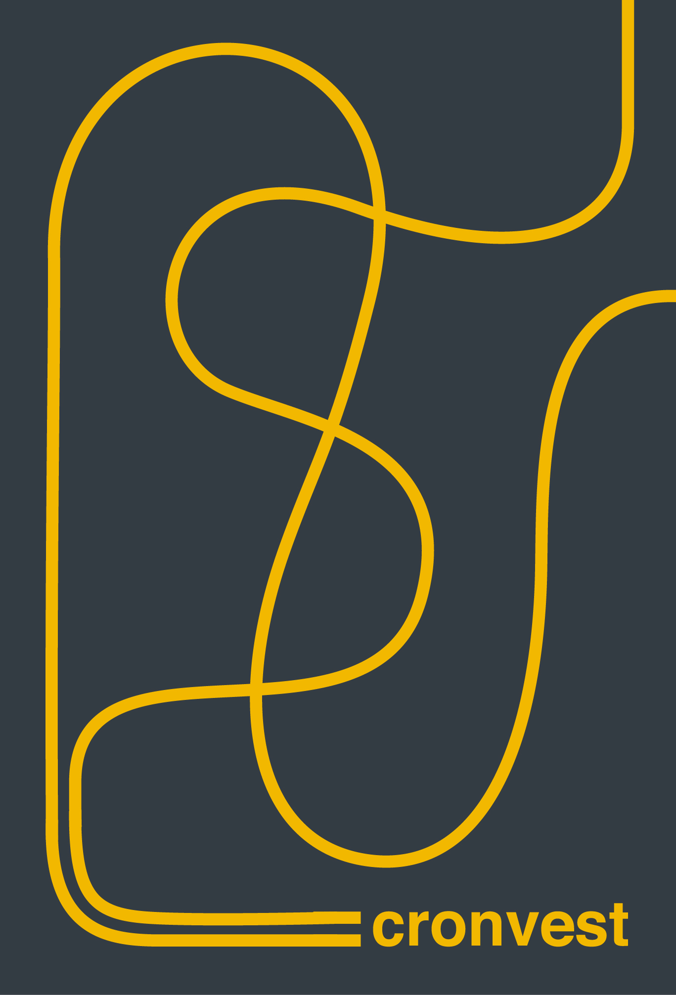
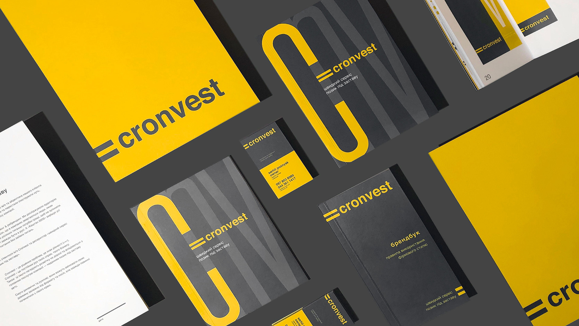
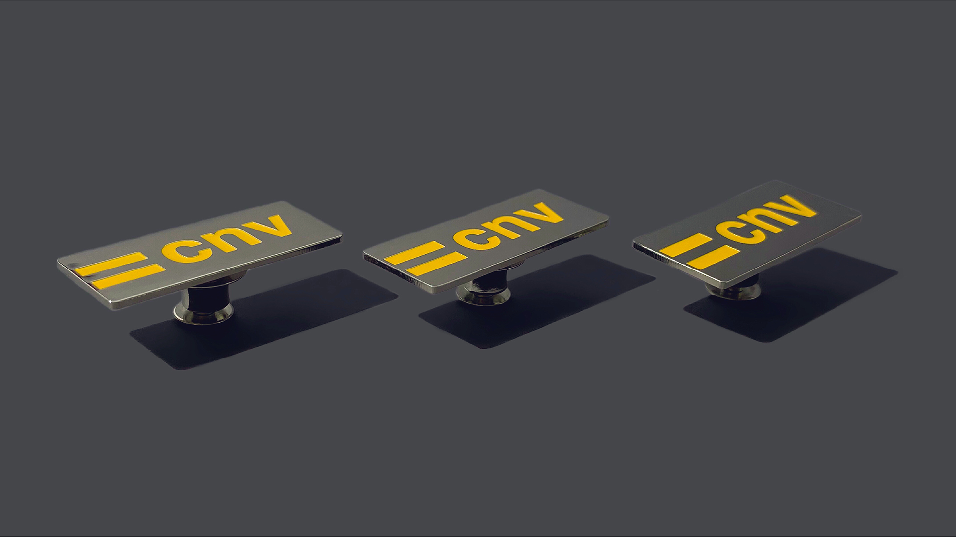
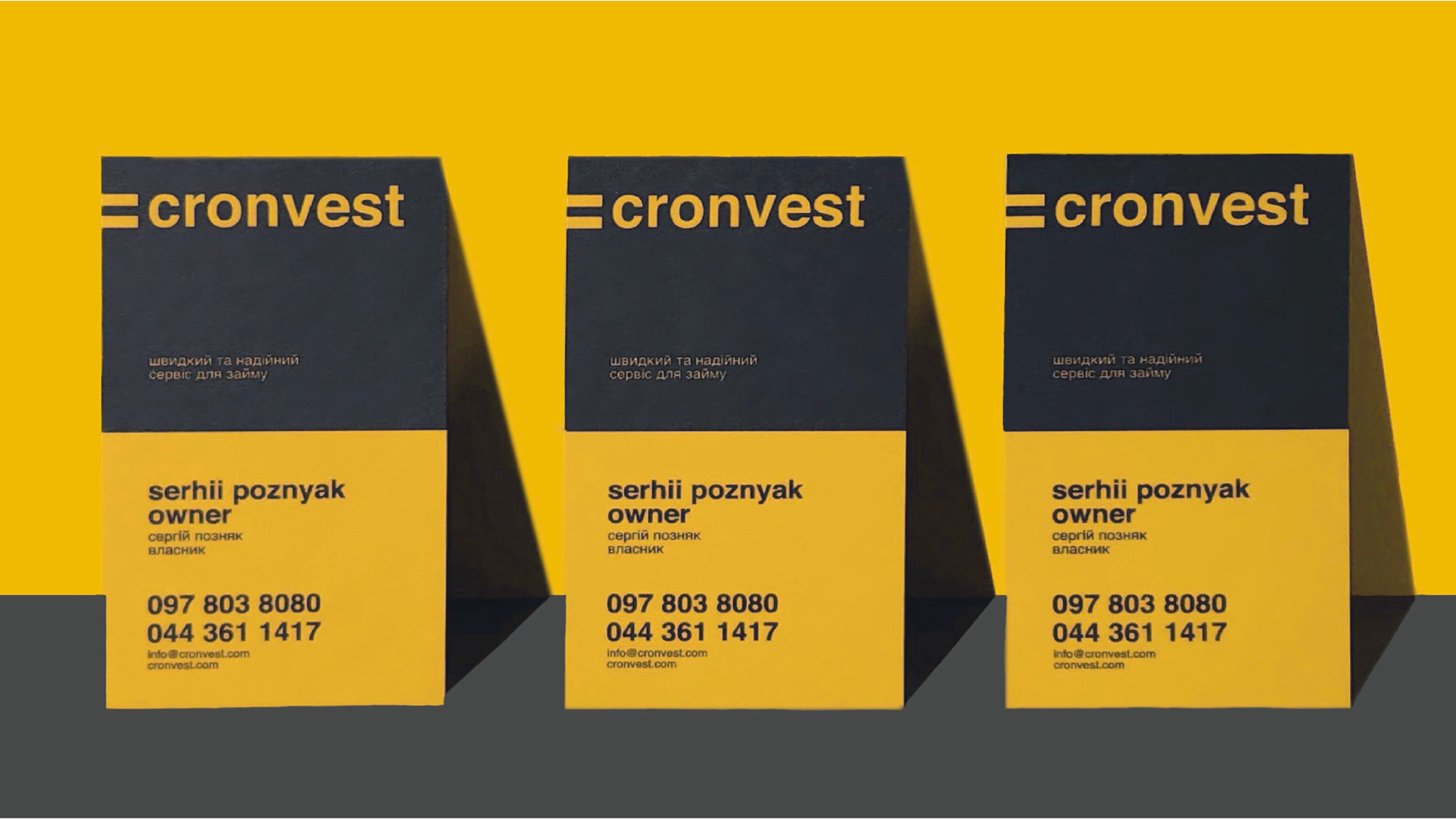
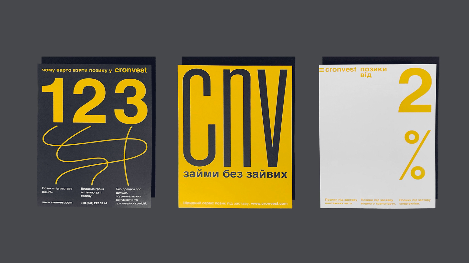
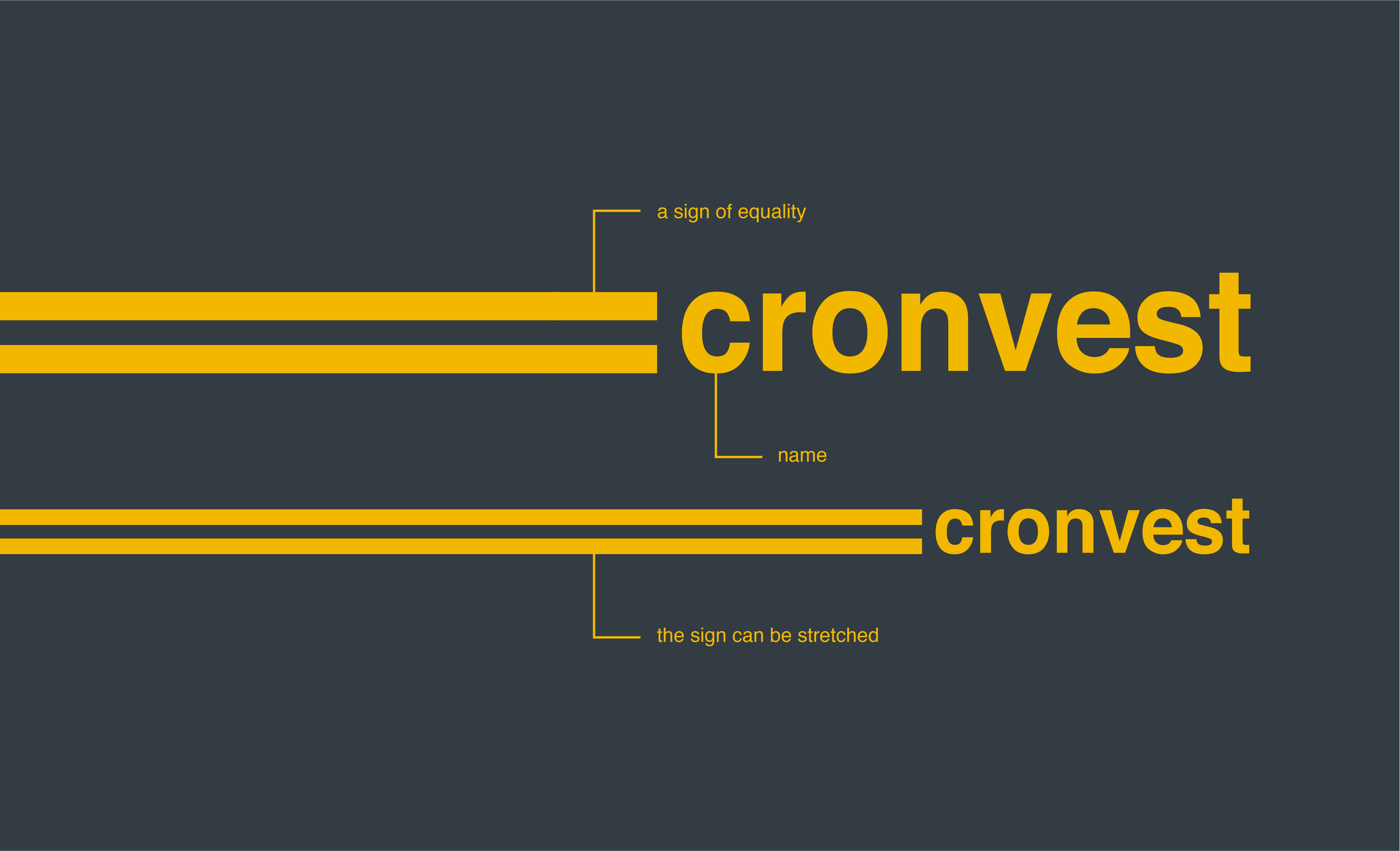
Cronvest is problems solutions, it is a sign of equality (“=”).
Cronvest is a constant movement of your business.
Also, these lanes resemble road marking and are it’s associated with the company's main service – loan against car.
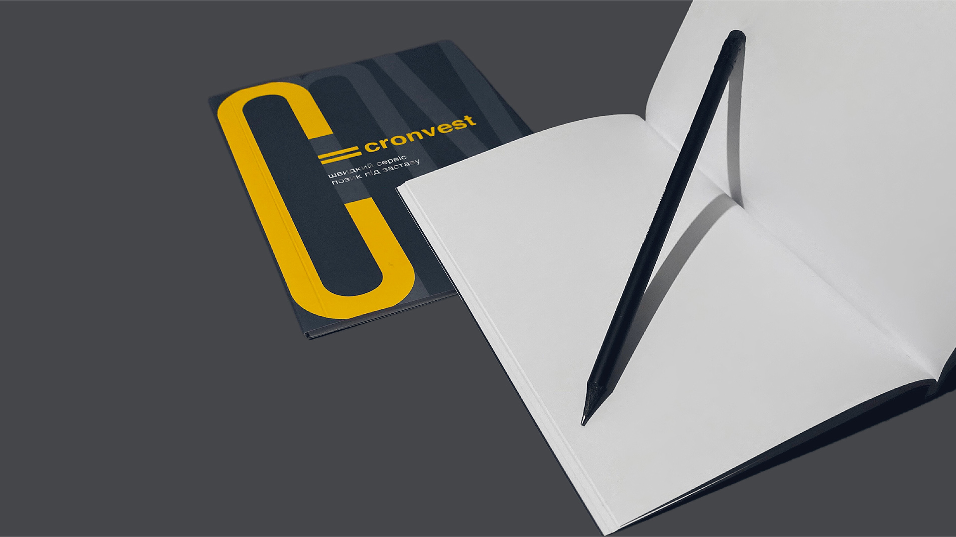
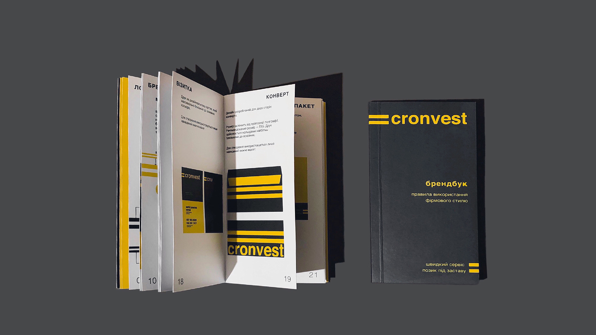
Strips are dynamic and mobile. They can vary in length depending on the format and media, but should always start at the left edge.
The Cronvest palette is the “road” colours: an asphalt and a road marking, indicating the movement direction.

Realization